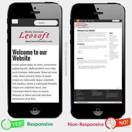
This type of web design is the web standard nowadays that suggests that design and development should respond to the user's experience based on their screen size, platform and orientation. It contains the intelligent use of flexible grids and layouts, images and CSS media queries. We offer Responsive Website Designing services in following cities in the Punjab State (India) :


Responsive Web Design (RWD) is a standard in Web Design Technologies which makes web pages make viewable on a variety of devices or screen sizes. CSS Media queries allow the web page to use different CSS style rules based on characteristics of the device the site is being displayed on, most commonly the width of the browser. In simple language, a Responsive Website is one that adapts to the screen size of the device where the website is being served. So when the page resizes, the layout adjusts according to the fit of the screen.
Responsive Web Design is a relatively new approach to website design that ensures users have a good viewing or browsing experience no matter what type of device they’re using. It’s become increasingly important over the last few years as mobile device ownership has exploded enough and traditional PC sales have sloping down. And now that majot search engines like Google, Yahoo and Bing are prioritizing mobile-friendly sites in its search results algorithm, it’s essential to make sure your site is optimized for mobile view by using Responsive Design.
Super Flexible Design
Excellent User Experience with Easy Navigations
Very Cost Effective
Recommended by Major Search Engines i.e. Google, Yahoo, Bing
SEO (Search Engines Optimization) Compatibility
The answer to this query is little bit tricky. It totally depends on the need of the end user. According to recent data Mobile devices are used more than traditional computers for web browsing, as smartphone and tablet use overtook desktop for the first time in history. It seems that web browsing on the computers will be a thing of the past in the future.
Mobile web browsing has been steadily growing since 2010, while the desktop’s share of web traffic has steadily decreasing. The two crossed over, with global mobile and tablet browsing accounting for 56% vs the desktop’s 44%, according to the latest survey.
So don't forget to be mobile first. But it doesn't mean that you forget about the Desktop version. Users can reach you from anywhere. So be future ready, Be responsive. :)